Facebook Ads For Dentists – Real Examples
Do you want to get more people into your dental clinic with Facebook Ads?
Maybe you’re not sure where to start. Or maybe you’re already running ads but not getting as many new patients as you want from your campaigns.
One of the best ways to improve the performance of your Facebook Ads is by looking at what other advertisers are doing in the same industry.
This article offers both good and bad examples of what other dental clinics are doing on Facebook Ads.
In this article, you’ll discover…
- The differences between different ad formats (image, video and carousel)
- The best type of images to use in your ads
- The biggest mistakes to avoid in your ads
- A psychological trigger you can use to motivate people to take action
Using Urgency To Motivate Action

The Good
In this example, Primary Dental provides a great example of how urgency can be used in your Facebook Ads.
In Australia, the benefits received by members of private health insurers usually reset at the start of the new year. That means if you don’t use your full dental benefit for the year, you miss out.
Primary Dental create a sense of urgency by reminding people that this reset isn’t far off – this ad is being run in early December.
The use of urgency can be a powerful motivator because people have a natural tendency towards inaction. Especially when it comes to booking a dentist appointment (unless it’s an emergency).
When people know that they have a limited time to act, they will be much more motivated to take action.
Learn More About Urgency In This Post
I also like the use of checkboxes to highlight key features and benefits of this dentist. This is something I do in my own ads. It works well because it makes the ad copy easier for people to read quickly and will capture more attention than large blocks of text.
The Bad
I typically find that in service-based industries like dental, carousel ads produce higher cost conversions than single-image ads.
My other main criticism would be the landing page this ad is going to. Because Primary Dental have multiple locations throughout the country, users are taken to a page where they search for a dental practice near them.
If Primary Dental could make this process easier, their conversion rate would likely increase significantly.
You should always try to make it as simple as possible for a potential customer to book an appointment with you or register their interest. Any extra complexity can significantly lower your conversion numbers.
Importance Of Ad Copy & Visuals

The Good
It is difficult to find any positives in this ad.
The Bad
I’ll start with the image. This is a terrible choice of image. Can you imagine anyone on Facebook being inspired to stop scrolling through their feed to look at a picture of a tooth and some dental equipment?
Even the sight of the dental tools is probably enough to start producing anxiety in some dental patients. Your images are an opportunity to make people feel better about coming into your dental clinic. You’ll see in other examples below how this can be done.
Aside from the very poor choice of image, the ad copy is also very uninspiring. It sounds too generic, which makes it less impactful and less believable.
To me, it feels like this ad was created by an admin assistant or receptionist in the clinic. And this highlights the importance of either hiring experts to create your campaigns or educating yourself before creating campaigns.
Use Real Images


The Good
The last example showed us what not to do in your Facebook Ad image. But the images above from Dental Precinct Townsville and Centrepoint Dental offer great examples of images that can work well.
Both advertisers have used real images featuring staff members in their ads. And there are a few reasons why this works well.
Firstly, an image like this is less likely to trigger people’s advertising defences. Compared to the previous examples, these ads look less like an ad.
Many people will automatically tune out and skip ahead when they recognize an ad in their feed. And then you never have the opportunity to get them to click on your ad. This is why I recommend avoiding the use of stock photos in most cases.
But a real, authentic image can be enough to stop someone in their tracks and pay attention to your ad.
Secondly, it helps to develop more trust and connection with potential clients before they even step foot in your clinic.
Not knowing what to expect is just one more factor that can add to people’s anxiety levels when visiting a new dentist. But your Facebook Ads (and your website as well) are an opportunity to reduce some of that uncertainty.
Use real images so your potential customers can see what the inside of your clinic will look like. And what the staff serving them will look like. This can set you apart from competitors who use stock photos in their ads and website.
A video featuring your staff can also achieve this. However, I recommend starting with images first and using that as a benchmark to test video against.
The Bad
I would like to see these advertisers test those same images but with a small amount of text added in.
A format featuring a mix of image and text like this example from Fieldstone Dental could work well.

When you use an image only in your ad, you will tend to get more clicks on your ad. But you’ll typically find that your conversion rate will be much lower than when you include text in your graphic.
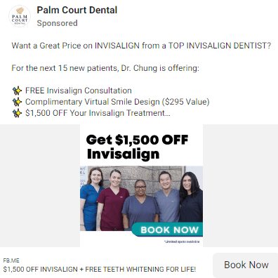
Provide A Strong Offer

The Good
There is a lot I like about this ad from Triangle Family Dentistry. But I particularly like the compelling offer they’re presenting in the ad.
A strong offer can improve the performance of your ad more than anything else. Yet, many advertisers don’t even include an offer in their ad – which can still work but will be much more difficult.
To make the offer more powerful, they have also highlighted that there are only 50 appointments available, which creates scarcity.
Scarcity is one of the most powerful persuasion triggers you can use in your marketing. This is because people place a higher value on things that are in scarce supply.
As with urgency, which I discussed earlier, scarcity can also be used to motivate people to take action.
Aside from the offer, Triangle Dentistry has also included an excellent real image featuring their staff in the ad. I have already discussed why this works well.
They have also included a call to action in their ad copy telling people the next step to take. Their call to action is “click on the get offer button to secure your appointment today.”
This may not seem like a big deal. But having a call to action in your ad copy can make a big difference to the performance of your ad. If you don’t tell people what to do next, many won’t do anything at all.
The Bad
There isn’t a lot to criticize about this ad. But I would like to see them make it even clearer what the offer is.
Yes, they do mention the offer twice in their ad text. And then again in their ad headline. But even this won’t be enough to get many people’s attention.
When you’re presenting a strong offer in your ad, you want to make sure people won’t miss it.
One of the best ways to make your offer even more prominent is by including it in your ad graphic. See this ad below as an example.
This ad uses bold text in their ad graphic to make it absolutely clear what their offer is. Someone scrolling through the Facebook feed is far more likely to notice this than anything in the ad text or headline.