Landing Page Examples (Good & Bad)
A landing page can make or break your advertising campaign.
Get it wrong and your conversion rate will be much lower than it could be. Leading to high costs per lead and possibly lower quality leads.
There is a lot you can learn from reviewing other landing pages. You start to see some of the deadly mistakes that kill conversion rates. But you also get ideas to implement which will supercharge your own landing page.
In this article, I look at some examples of both good and bad landing pages.
You’ll see some mistakes that you absolutely must avoid on your landing pages. And you’ll see some incredible ideas that you can copy for yourself.
1. Blue Farm Digital Marketing
This digital marketing agency is running Facebook Ads to this landing page. Below is the desktop version of the landing page header.
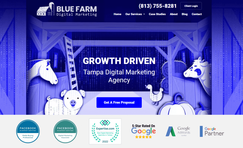
Headline
This header could be made much more effective with a more compelling headline. “Growth Driven Tampa Digital Marketing Agency,” adds very little value to the landing page.
The headline at the top of your landing page is your best opportunity to capture attention and generate interest.
If you have a good ad running, it’s possible to still get away with a boring headline like this one but it’s still a wasted opportunity.
For a service-based business like this one, I’d prefer to see a benefit-driven headline that would get a client excited. You will see examples of the benefit-driven headlines I’m talking about later in this post.
Call To Action
It’s good that they have one clear call to action in their header – “Get A Free Proposal.”
The button leads to a contact form on another page of the website. Personally, I prefer to have lead forms on the landing page.
Sending people to another page adds one extra unnecessary step to the process for users. And usually, that will lower conversion rates.
There is also a lead form at the bottom of the landing page. I would prefer if the “Get A Free Proposal” button took users to that form rather than going to a different page on the website.
Sales Copy
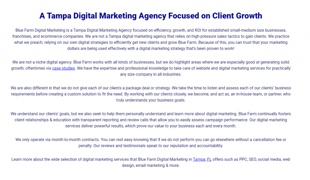
A good landing page should contain easy to read sales copy that builds desire for the offer.
The copy above is too bland and generic in my opinion. It doesn’t do enough to set them apart from competitors.
Look at this from the perspective of a business owner searching for a digital marketing agency…
You would be looking for reasons why you should use Blue Farm Digital Marketing over other agencies. And you want to know how your business will benefit from working with this particular agency.
They make some attempt to differentiate themselves by saying “we are also different in that we do not give each of our clients a package deal or strategy.”
But how does that benefit the client?
They also talk about listening to customers’ requirements and creating a custom solution. Unfortunately, this is not compelling enough. It’s too generic. Most digital agencies will say the same thing.
Lessons
- Avoid bland, generic sales copy on your landing page.
- Include a benefit-driven headline at the top of the page.
- Keep your lead form on the landing page instead of taking users to a different page.
The Verdict
Overall, this landing page is simply not compelling enough. There are thousands of digital marketing agencies that businesses can work with so you need to stand out.
There are also no client testimonials on the page, no proof of results achieved or anything else to make potential clients feel confident that they will get results from working with this agency.
The sales copy is bland and uninspiring. And the page design is unlikely to win anyone over either.
Rating: 3/10
2. Tai Lopez Crypto DeFi Accelerator
This is the landing page for Tai Lopez’s latest online course, the Crypto DeFi Accelerator.
Tai has generated millions in sales for digital information products. There is a lot to learn from his advertising and landing pages, particularly the psychology behind them.
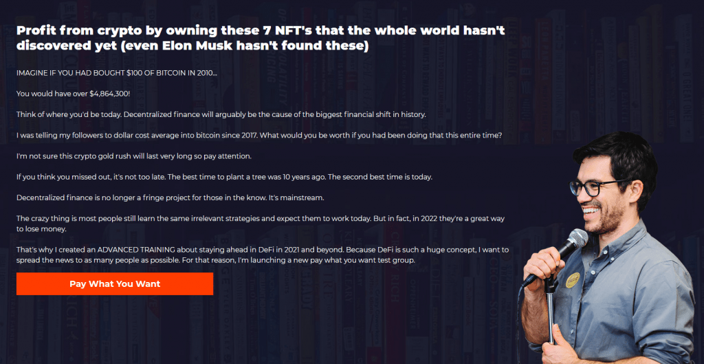
Headline
In the previous example, I criticized Blue Farm Digital Marketing agency for not having a benefit-oriented headline on their page.
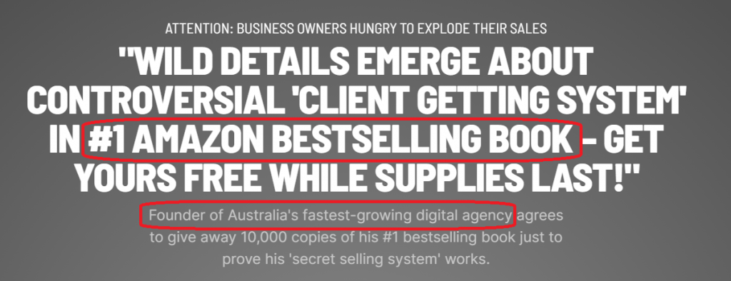
This is an excellent example of a benefit-oriented headline…
“Profit from crypto by owning these 7 NFT’s that the whole world hasn’t discovered yet (even Elon Musk hasn’t found these)”
The benefit here is very clear. You can profit by buying these NFT’s. Immediately, the reader knows what they can gain from this offer.
Personally, I would like to see something even more specific than this. Eg. “Profit from crypto by owning these 7 NFT’s in just 30 days.” But I imagine that Tai is probably constrained by regulations and compliance issues in this particular space.
The headline also generates curiosity – a very powerful component to use in headlines. The reader wonders “what are these 7 NFT’s?”
It also begins to stimulate the imagination of the reader. Maybe these NFT’s could be their ticket to making a lot of money.
Sales Copy
Look at the language used in the screenshot above.
Tai uses short sentences, short paragraphs and simple language to draw the reader in. The best copywriters in the world understand the importance of easy to read sales copy like this.
Yet so many landing pages violate this key principle.
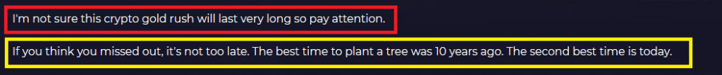
The first sentence above creates a fear of missing out. It makes the reader think “I should get in now before the crypto gold rush ends.”
And the second sentence addresses a key concern many readers would have – that it’s already too late to profit from crypto.
Good landing page sales copy should always address major concerns and objections that potential customers would have.
Personally, I think the sales copy above could create some resistance in many readers.
The average person in 2022 knows very little about NFT’s. It’s still a new concept and foreign to most people.
I would imagine many readers would feel overwhelmed when they see terms like “APY’s”, “staking” and “liquidity pools.” They will begin to wonder whether the content will be too difficult to comprehend and whether it’s worth the effort.
Given the complexity of NFT’s and cryptocurrency, I think Tai would have been smart to keep the language on this page very basic. And focus on reassuring the reader that the course content will be easy to understand, even for someone who doesn’t know anything about NFT’s.
Lessons
- Place a major benefit of your offering in your main headline.
- Stimulate curiosity in your headline and/or sales copy.
- Use simple to understand language.
The Verdict
This is not the best landing page I have ever seen from Tai Lopez. But there is still a lot to learn from it.
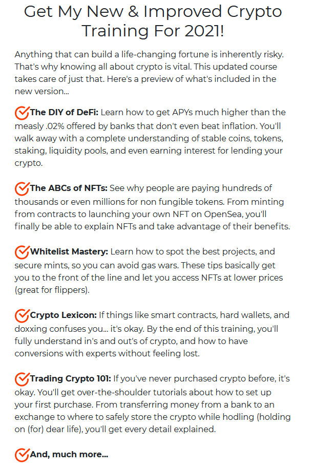
I would like to see more user testimonials on the page and also more information about what content is contained in the course. But given the “pay what you want” offer, perhaps he feels this isn’t necessary.
Rating: 7/10
3. My Coach School New Year Challenge
This landing page is promoting an 8 week fitness challenge. The challenge is being promoted through Facebook ads.
Countdown Timer
A common psychological driver used in marketing campaigns is urgency. Think of limited time offers, one-day sales, etc..
Urgency creates a fear of missing out, which drives people to make decisions. One way to implement urgency on your landing page is through a countdown timer.
My Coach School have used a countdown timer on this landing page to create a sense of urgency. If users don’t act quickly, they will miss out on a 50% discount on the offer.
Headline
“8 Week Challenge” is the main headline on this page. This makes it clear what the offer is and clarity is important in marketing.
But I would like to see a sub-headline beneath this main headline that’s more specific and benefit-oriented.
For example “Lower Your Body Fat, Increase Your Energy Levels and Feel Better In Just 8 Weeks.”
When someone visits a landing page, they want to know if the offer is suited to them. They want to know what they’re going to get out of it. The faster you can communicate that, the better.
Step By Step Process
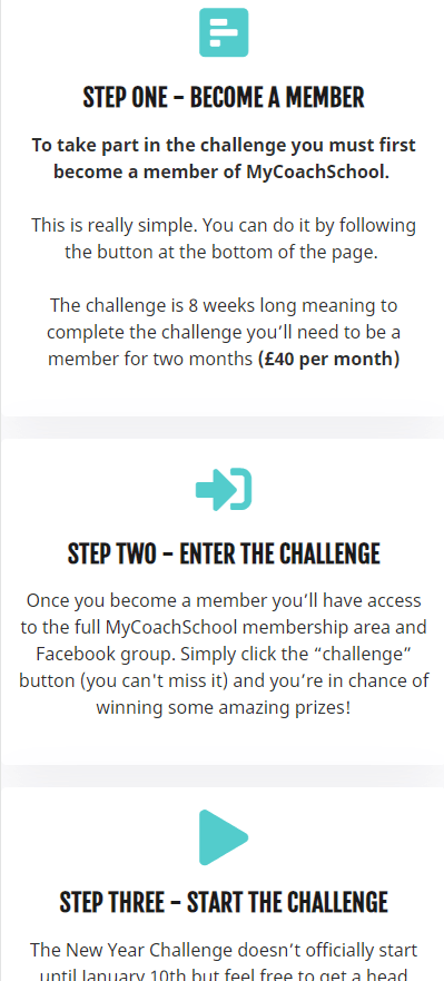
This step by step process is a great addition to the landing page. It gives the reader clarity on what to expect when they join the challenge.
The reader can quickly scan through this chart and quickly learn what will happen from the time they join the challenge to the time the challenge begins.
Lessons
- Using countdown timers on your landing page is a great way to create urgency.
- Quickly communicate to readers what you’re offering and what’s in it for them – your main headline and sub-headline is the perfect place to do this.
- Let the reader know what to expect next by including a step by step process.
The Verdict
This landing page is well laid out and the design looks clean and professional.
The page also includes before and after shots, frequently asked questions and a clear list of what’s included in the offer. All of which are great additions to the page.
Reading the content on the page, it appears that it’s targeted towards women wanting to lose weight but I think this could be made clearer.
For an offer of this nature, I would recommend also including some client testimonials. This would help to make readers feel confident that they can achieve their desired result if they register for the challenge.
Rating: 7/10
4. Sell Like Crazy Book
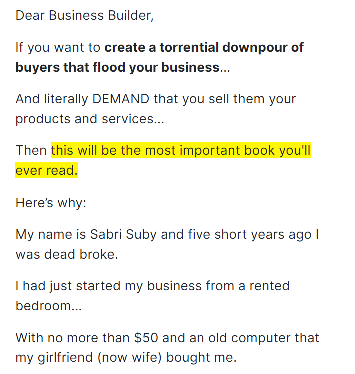
Sell Like Crazy is a sales and marketing book written by Sabri Suby, the founder of the digital marketing agency King Kong.
I’ve read the book myself – see my review here. Unfortunately, the book itself is rather disappointing. But the landing page for the book is jam-packed with incredible lessons about marketing and landing pages.
Headline
There is so much packed into this one headline and sub-headline…
Firstly, it answers the question “who is this for?”
We can immediately see it’s for business owners wanting to increase sales. If you’re a business owner, you know you’re in the right place.
While I criticized Blue Farm Digital Marketing for being too bland in their sales copy, Sabri Suby is on the complete opposite end of the spectrum. He uses click-bait style language that grabs the reader’s attention. There is nothing bland on this landing page.
With a headline like this, it’s hard not to continue reading.
Highlighting that this is a #1 Amazon Bestselling Book creates instant credibility and social proof. As does the phrase “Founder of Australia’s fastest-growing digital agency.”
Credibility and social proof are both powerful psychological triggers that you can use in your landing page.
Learn More About Social Proof In This Post
Sales Copy
Notice just how easy it is to read this content?
Each sentence draws you in further. It quickly captures your attention, creates interest and builds curiosity.
The short sentences and paragraphs make it easy for the reader. And the casual, personal tone makes it more enjoyable to read.
Compare that to the long chunks of text and impersonal tone used by Blue Farm Digital Marketing in the first example. It’s a huge difference.
The landing page contains over 7000 words of content but every word makes an impact.
Testimonials
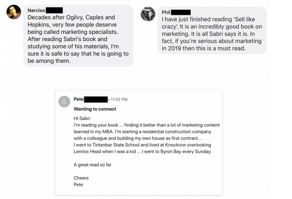
The page contains dozens of testimonials from customers who have read the Sell Like Crazy book. This includes text reviews and also video testimonials.
I like how he has included real screenshots of the testimonials above, rather than just pasting the text onto the page. This feels more authentic and removes doubt that they could be fake.
Customer testimonials are one of the most important elements to include on your landing page. They increase the certainty that the reader will get value from what you’re offering.
Lessons
- Address your target audience in your main headline or subheadline (this could also be done in your ad copy).
- Use powerful words and language that is interesting to read – especially in headlines and subheadlines throughout the page.
- If you have them, load up your page with customer testimonials.
- Use screenshots of testimonials and reviews so they appear more genuine.
The Verdict
Sabri Suby has covered everything on this landing page.
The sales copy is well written and compelling. It contains loads of testimonials and customer reviews.
He uses all sorts of psychological triggers which I discuss in more detail in my full analysis of the Sell Like Crazy landing page.
All of this makes for one extremely persuasive landing page that likely has a very high conversion rate.
Rating: 10/10